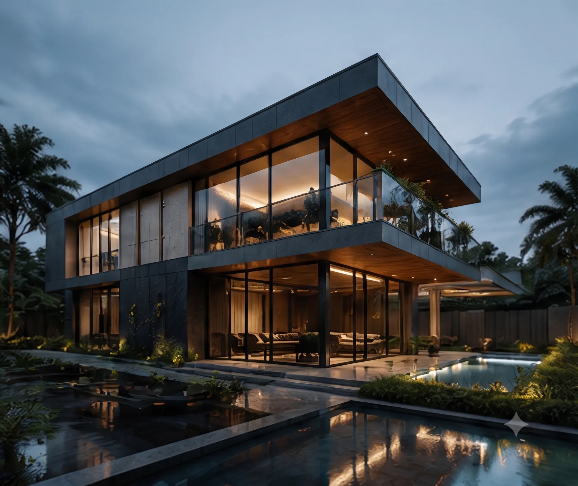
Every January the trend lists arrive, and every February we find out which of them a client will actually pay to build. After a year of handovers across apartments in Rajasthan, offices in Sakroda, and a hotel on the RTO road, here are the five that kept showing up in our drawings — and why they held.
1. Warm minimalism, not cold minimalism
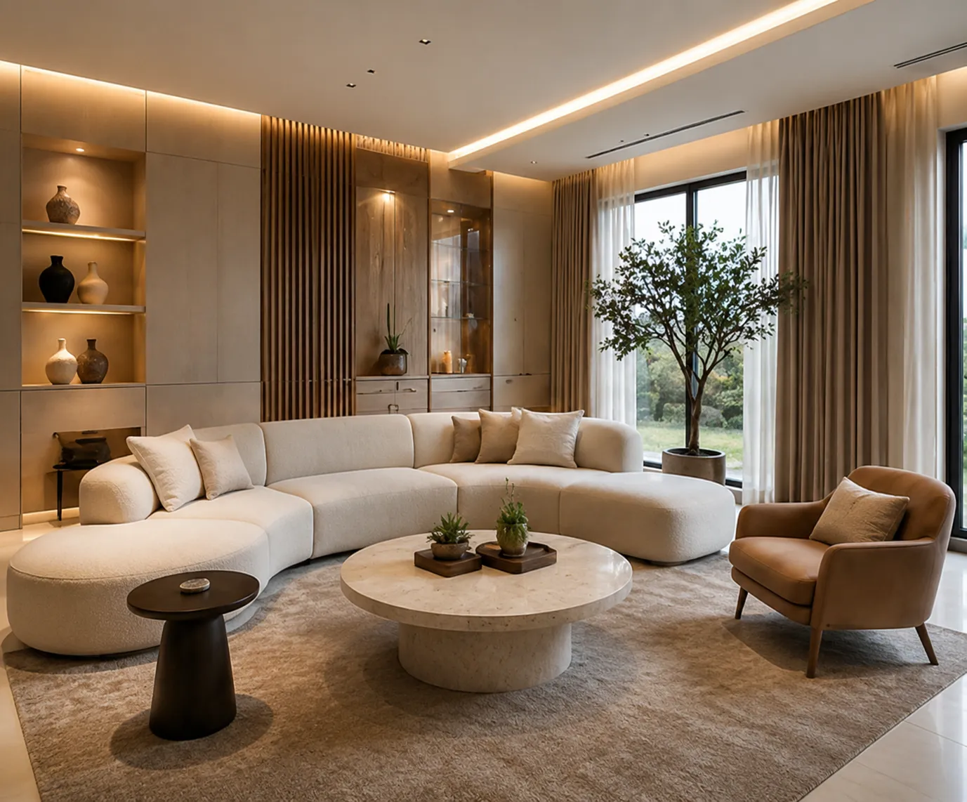
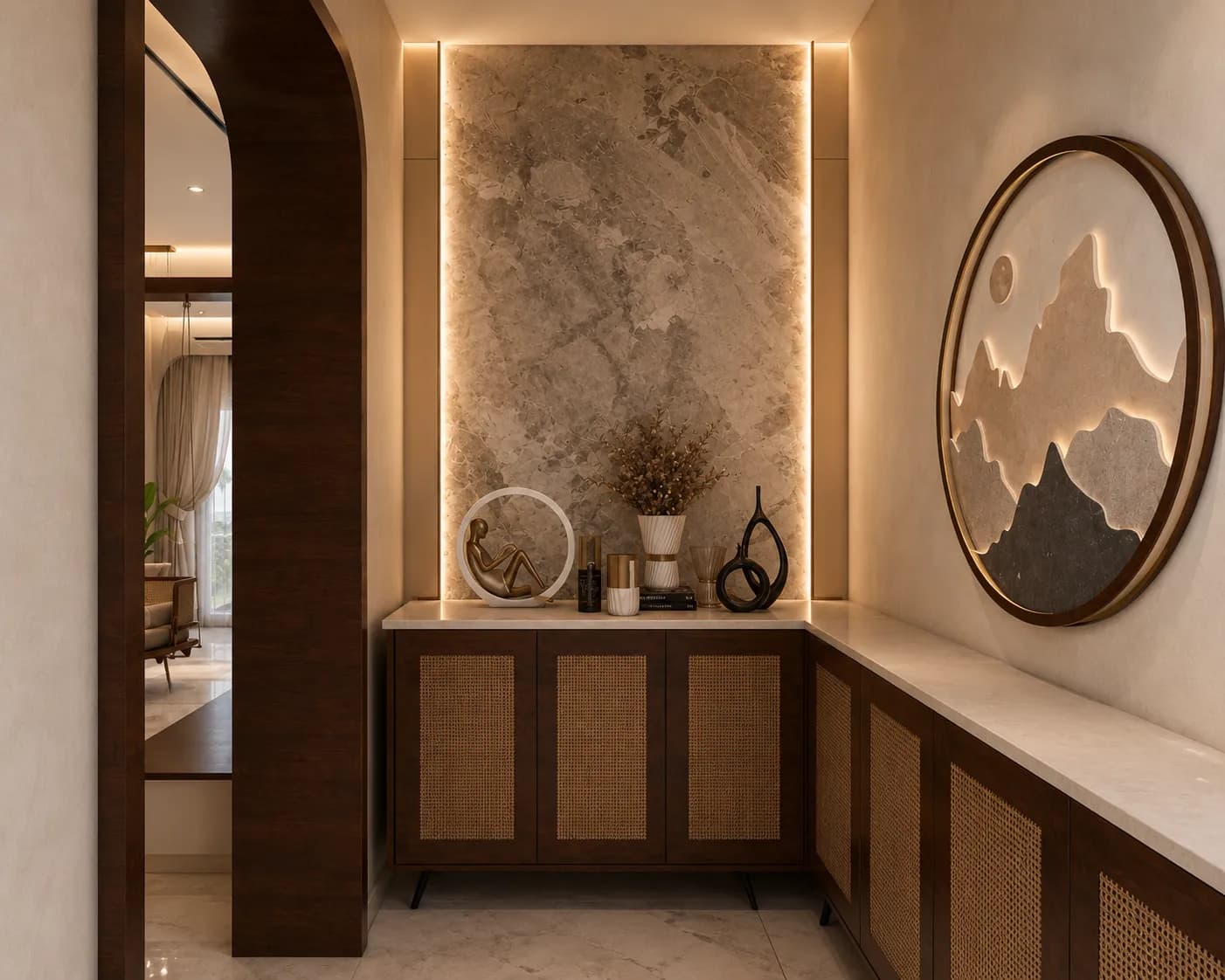
The stripped-back look is still here, but the temperature has changed. Bone whites, oat, putty, and sand have replaced the grey-on-grey palettes of a few years ago. It photographs beautifully, but the real reason it works is practical: warm neutrals hide wear far better than cool ones, and they sit comfortably under the yellow-leaning LEDs most Indian homes actually install.
2. Fluted and slatted wood, used with restraint
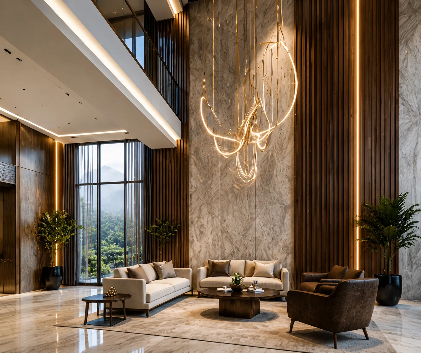
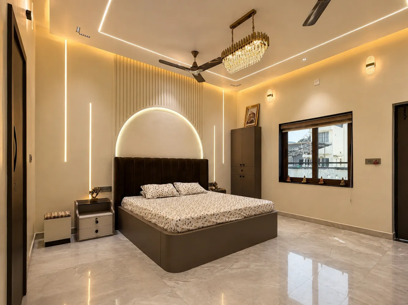
Fluted panelling has gone from a feature to a default, which is exactly when it starts to go wrong. Wrapped across every wall it flattens a room. Used on one plane — a TV back, a headboard, a reception face — it does the job it is good at: adding rhythm and depth without adding colour.
Our rule is simple. If the flute is doing structural work in the composition, keep it. If it is there because it was in the reference image, cut it.
3. Lighting in layers, specified early
The single biggest upgrade to a space is almost never a material — it's the lighting plan. Cove for ambient wash, profile lights for the working plane, and a decorative piece to give the eye somewhere to land. What matters is that this gets decided during planning, not after the false ceiling is closed.
A modest material palette with a considered lighting plan will beat an expensive palette lit badly. Every time.
4. Curves, where the plan allows
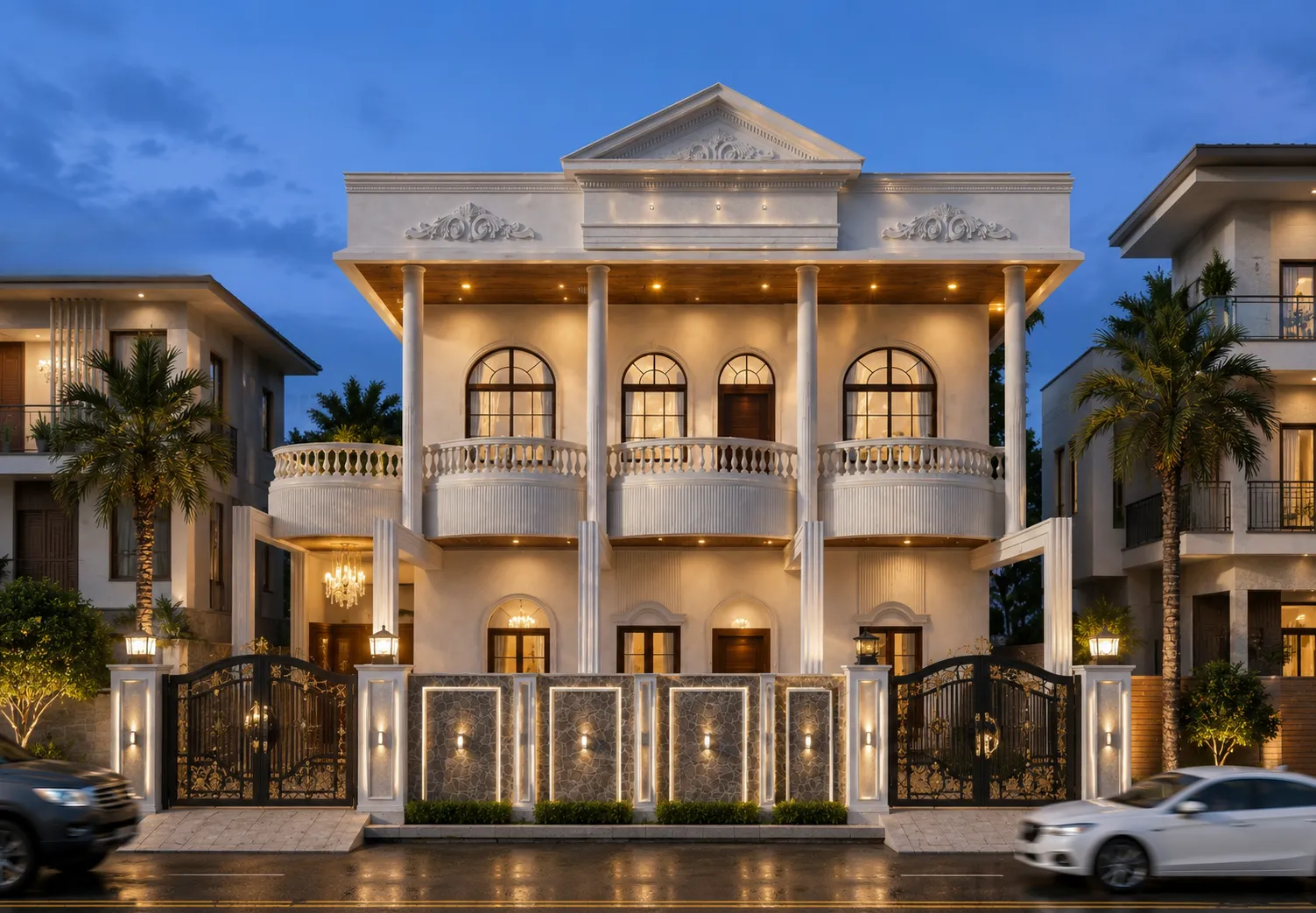
Curved sofas, rounded islands, arched openings. They soften a room and they photograph well — but they cost more and they eat floor area. In a compact 3BHK we will usually spend the curve budget in one place: the entry, or the island edge. In a larger residence like Sarvaritu Vilas, arched openings can carry the whole language of the house.
5. Stone that looks like stone
Large-format porcelain has improved to the point where the argument for slab marble in a high-traffic area is mostly emotional. We still use natural stone — but increasingly on the vertical, where it is seen and not scrubbed, and porcelain underfoot where it has to survive.
What we left out
Chrome everything, micro-cement in wet areas without proper detailing, and open shelving in kitchens that anyone actually cooks in. Some trends are photographs, not rooms.
Written by the Forty Seven Interiors studio team.
Start a project